
redesign the ticketing experience to help
users complete purchases confidently
Shedd Aquarium
UX Researcher & Designer
Eye Tracking, Questionnaires
The Shedd Aquarium reached out after noticing a pattern: an unusually high volume of customer support calls related to the "Programs & Events" checkout. The team reported that most users were getting lost, confused by pricing, and abandoning purchases mid-flow.
GOAL
primary method
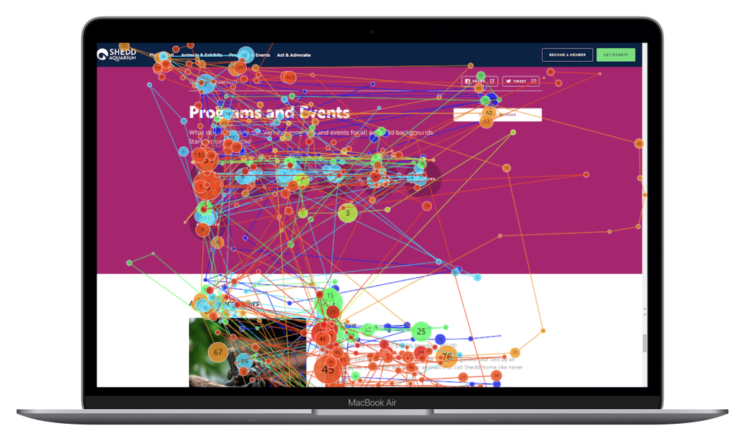
Revealed where users were actually looking not where they said they were looking. Heat maps exposed attention black holes and surfaces that drew focus away from key decision points.
Secondary Method
Captured the subjective experience: how confident did users feel? Where did they feel uncertain? This gave emotional context to the behavioral data from eye tracking.
Why this combination mattered
Eye tracking shows what users do. Questionnaires explain how it felt. Together, they revealed not just that users were struggling but why the confusion felt invisible until it was too late to recover from.
Eye tracking showed high concentration on program descriptions as users tried to orient themselves before finding content.
Finding 1
Questionnaire data confirmed the eye tracking signal: users desired more indication to what is a program or an event without needing to decode the company language.

The cart progress bar gave no indication of reservation status or upcoming costs. Add-ons appeared without context, users who had committed mentally to a price were surprised at a different number at checkout.
Finding 2
Unclear checkout pricing led to unexpected charges, creating a support burden that was entirely preventable through earlier cost transparency.
.png)
.png)
Added a step-by-step progress sidebar showing users exactly where they were in the flow at all times. Introduced a transparent, real-time cost breakdown that updated dynamically as users made selections, the final price was never a surprise. Users always knew what they were committing to and why.
Rewrote the program headers to make offerings immediately clear. Added financial perk badges surfacing add-on costs and value upfront so users could make an informed decision before committing to a path. Reduced the cognitive work of comparison-shopping by presenting the right information at the right moment.
The redesigned checkout experience was delivered directly to the Shedd Aquarium, addressing the friction points uncovered through eye tracking and user testing. The final solution introduced clearer program headers, transparent pricing, and a streamlined checkout flow built to reduce confusion and support confident purchasing decisions.
Small language and layout decisions carry enormous weight — what feels intuitive to a designer can be a dead end for a user
Eye tracking makes invisible problems visible: attention patterns reveal confusion that users can't always articulate
Pairing behavioral data with self-report gives you both the what and the why
Checkout friction isn't just a conversion problem.