

MCSSP needed to build a digital presence that reflected its work and services across Mendocino County, CA as locals who needed the org's services often didn't know it existed.
We built MCSSP a trust-driven brand identity, a navigable resource hub, and a donation-forward site structure, all informed by research into how comparable non-profits build trust online.
4 Person Design & Research Team
August 2025 - December 2025
Prototype Delivered
I led the MCSSP's rebrand and UI design as the primary visual designer and collaborated on UX research on this project, working alongside fellow UI/UX consultants from Pratt's Center for Digital Experiences.
The team created the research plan with the priority of identifying where MCSSP falls short in user expectations in comparison to similar organizations.
Learn how comparable organizations establish a digital presence and earn higher engagement and donations.
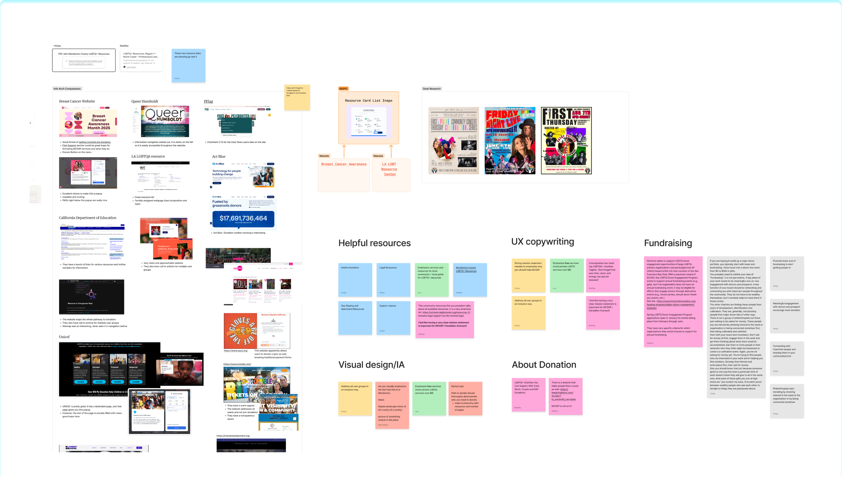
Competitive Analysis
We compared MCSSP with similar non-profits to see how they present their mission, services, and calls to donate.
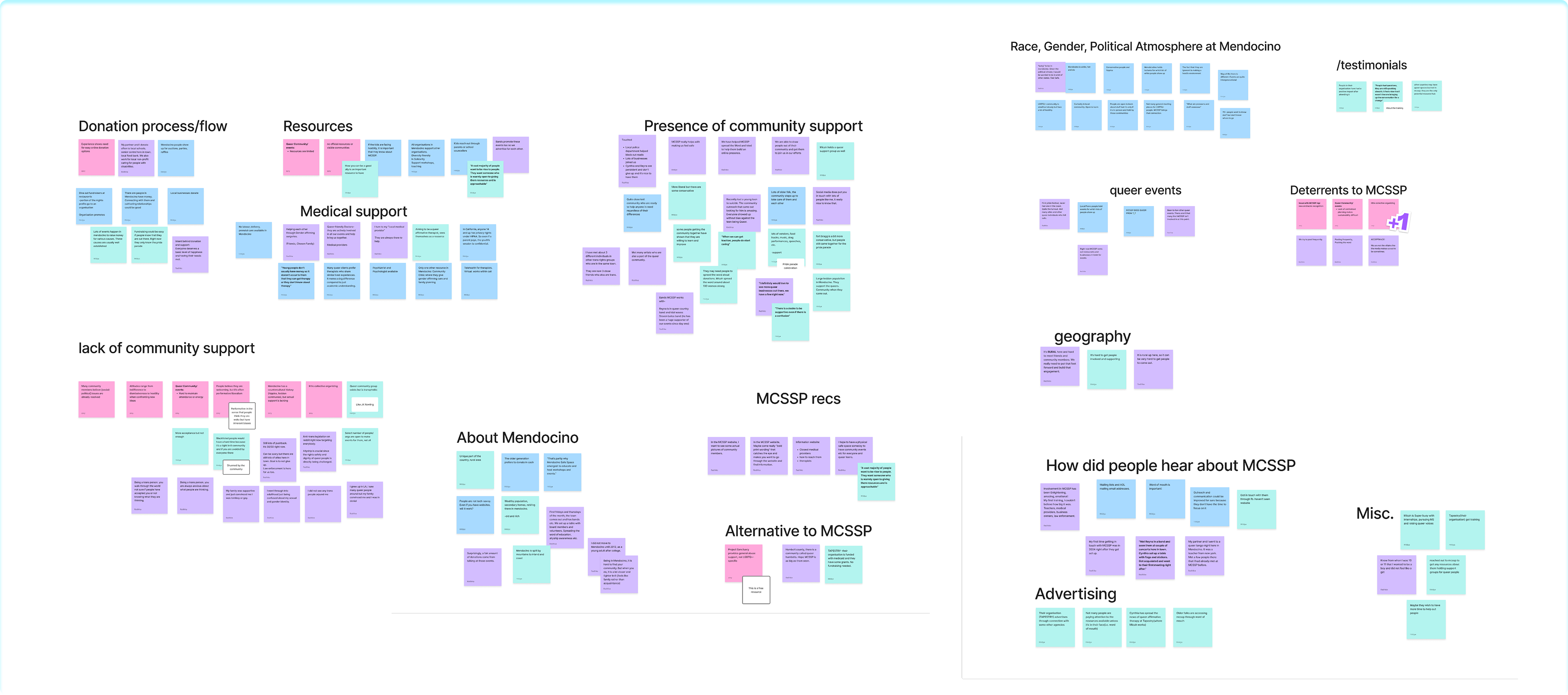
Affinity map
We organized stakeholder and community input to build a complete picture of MCSSP’s role locally.
Four findings guided our next steps by showing what users expect from, and need from, an organization like MCSSP.
To make MCSSP’s impact in Mendocino more visible, we aimed to increase engagement by making resources and community presence explicit and easy to navigate.
MCSSP needed a site that makes locals aware of its services for Queer youth and encourages donations to sustain them.
Build a navigable resource hub for Queer youth in Mendocino County that also looks like an active, welcoming Queer community.
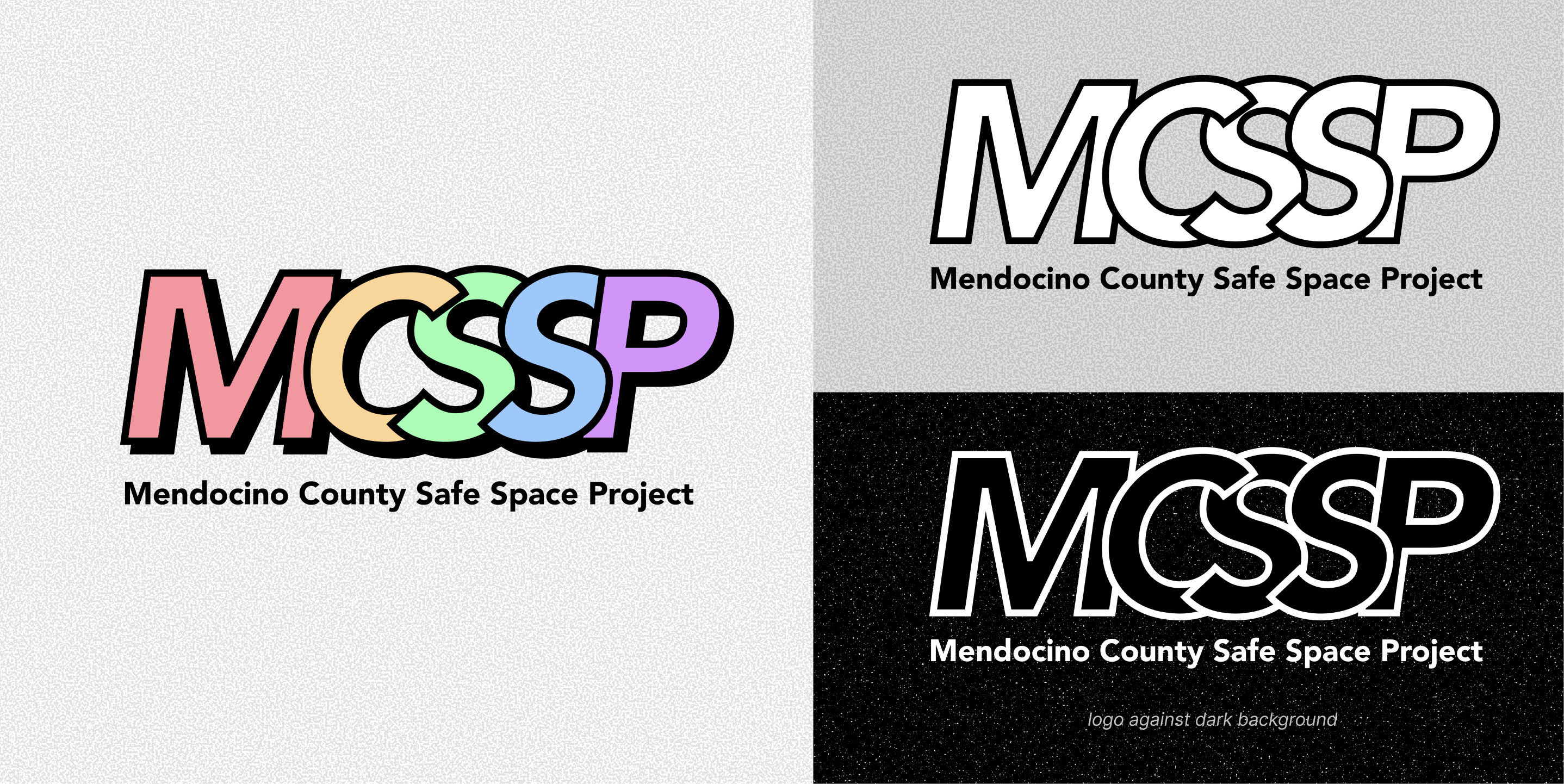
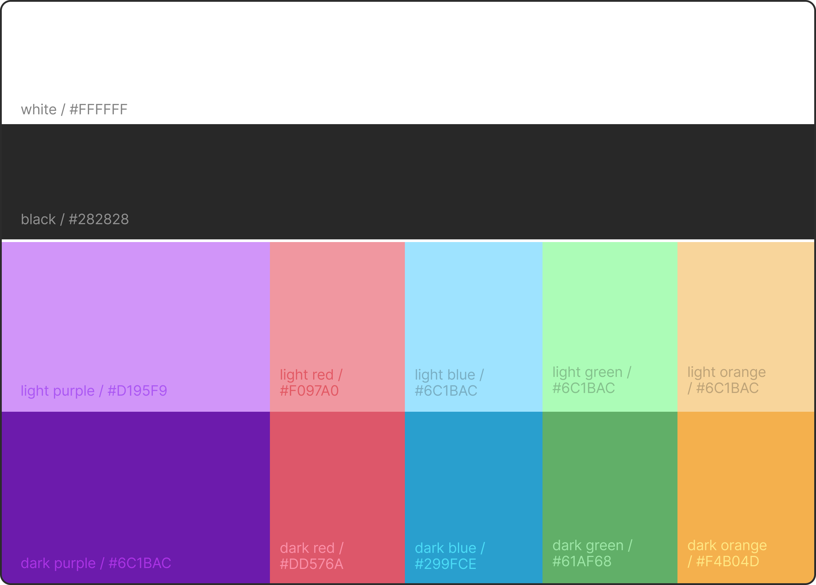
The new identity presents MCSSP as an approachable support center for young people. The research pointed to visibility and trust as the main barriers to reaching the community, so we built the palette and typography to signal friendliness and queerness at first glance.

The final deliverable was a high-fidelity prototype of the redesigned website, built on a design system of the new brand’s colors, type, and components. It shows how a visitor moves through the key pages, from a first welcome on the homepage to finding a specific service or resource. MCSSP can use it as a blueprint for development and for gathering feedback from the community before building.
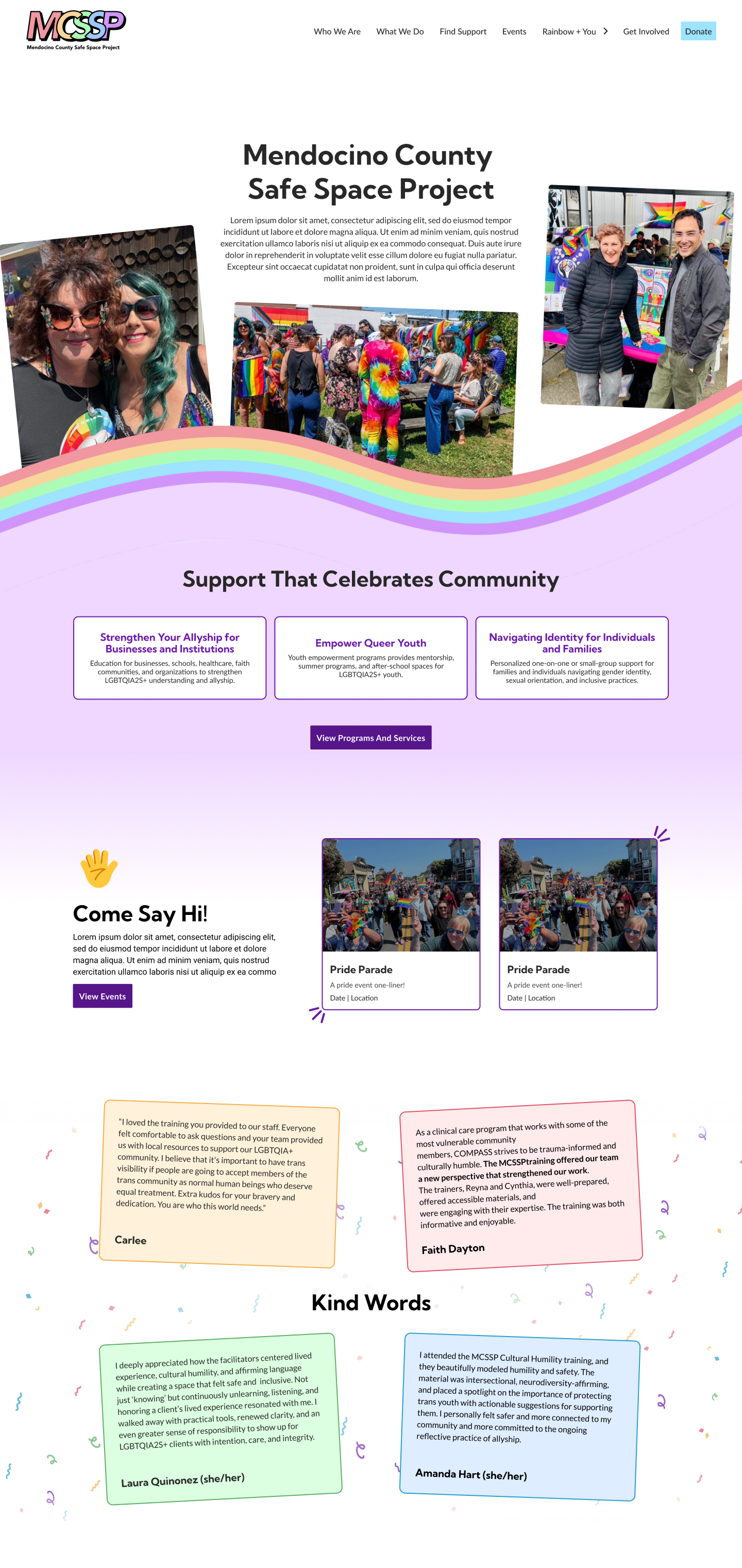
Hi-Fidelity PrototypeThe homepage welcomes new visitors and states what MCSSP is: an open, welcoming resource for Queer youth, parents, and allies. It was designed to build trust in the first few seconds.
Vibrant Color Palette
Communicates pride and celebration and establishes MCSSP as Queer-centered
Use of Candid Photography
Shows the real people and community behind the organization
Pathways to Services and Offerings
Clear routes into services, events, and support
Use of Testimonials
Build trust and show the impact MCSSP’s services have on people and organizations
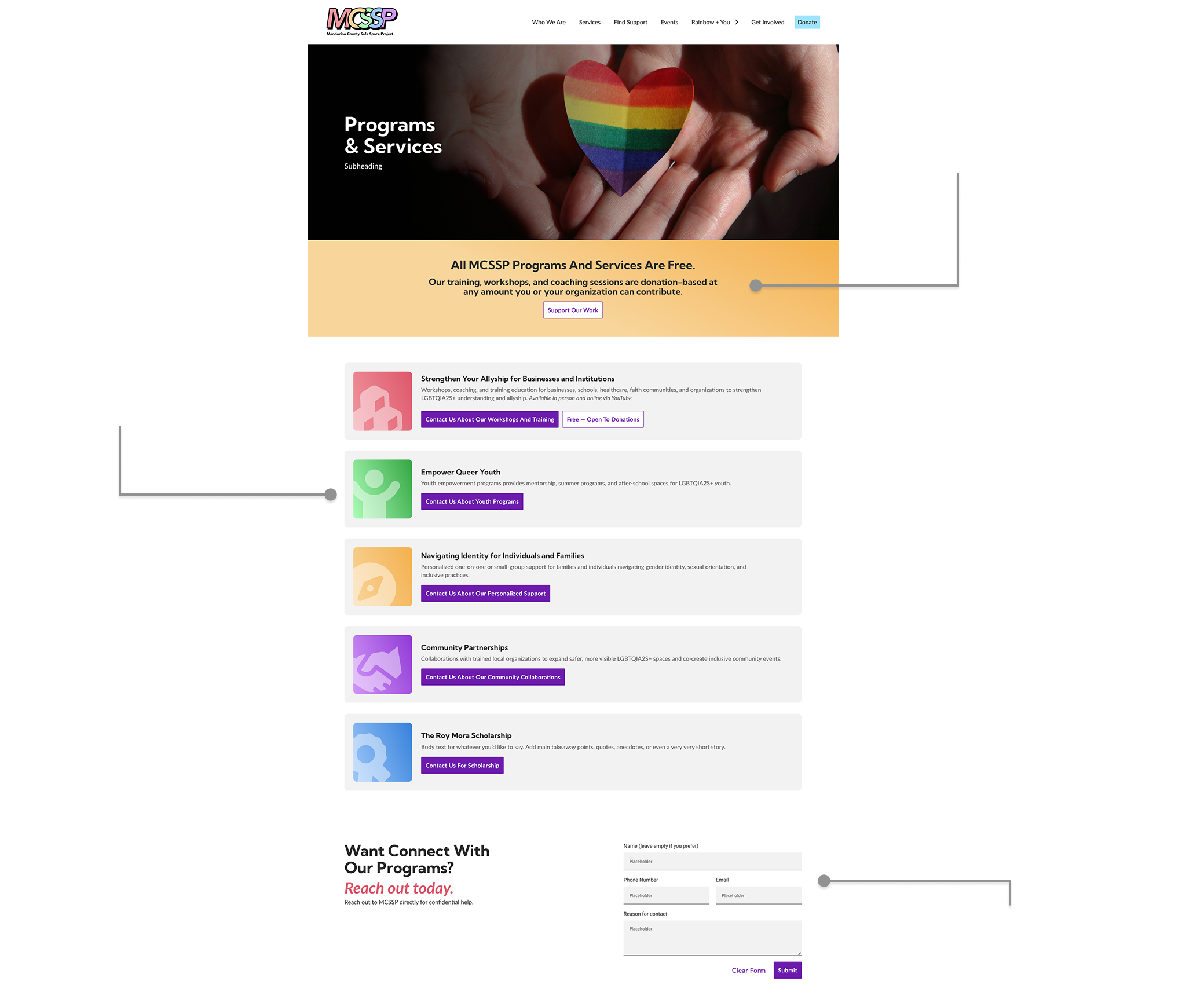
An easy-to-navigate directory of the programs and services MCSSP offers, plus local and national resources. The community said it wanted more visible resources, so this page connects locals to support in Mendocino County and beyond. It tells individuals and partner organizations exactly what MCSSP provides for Queer support and education.
This page celebrates MCSSP’s mission and highlights positive Queer representation and allyship. It’s a narrative counterpoint to the resource-heavy pages, showing MCSSP as a source of positive Queer information for youth, not only a place for crisis support.
Words of P.R.I.D.E
Published content on making Pride a positive, informed experience
Watchlist
Recommendations that give positive Queer media more community exposure
LGBTQ+ Spaces
A spotlight on local Queer-friendly and Queer-owned businesses and spaces

A comprehensive, easy-to-navigate directory of local and national resources. The community of Mendocino County desired more visible resources, the redesigned Resource & Support page connects locals to community and nationwide support.

Every decision was grounded in research, from competitive analysis to trust-building strategies. That positioned MCSSP as a credible, welcoming resource for Queer youth, allies, and parents. Designing for a community-driven non-profit reinforced that branding is never just aesthetic. Establishing trust required understanding not just what MCSSP does, but how the community needed to see itself reflected in it.