
Shedd Aquarium / Public Aquarium
Usability
User Research
Eye Tracking
UX Designer
UX Reseacher
Two methods chosen to reveal different aspects of the problem: quantitative data of user experience and qualitative data of post-testing emotional state.
Eye tracking
using Tobii Lab Pro
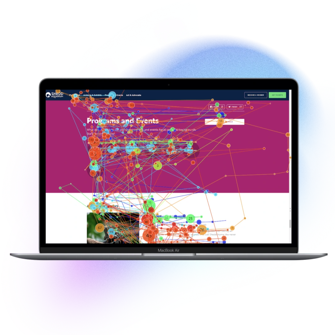
Revealed where users were actually looking not where they said they were looking. Heat maps exposed attention black holes and surfaces that drew focus away from key decision points.
Post-session
questionnaire
Captured the subjective experience: how confident did users feel? Where did they feel uncertain? This gave emotional context to the behavioral data from eye tracking.
Users struggled distinguish between Programs and Events offerings
Eye tracking showed high concentration on program descriptions as users tried to orient themselves before finding content.

.png)
Hidden add-on costs revealed too late in checkout
The cart progress bar gave no indication of reservation status or upcoming costs. Add-ons appeared without context, users who had committed mentally to a price were surprised at a different number at checkout.
The redesigned checkout experience was delivered directly to the Shedd Aquarium, addressing the friction points uncovered through eye tracking and user testing. The final solution introduced clearer program headers, transparent pricing, and a streamlined checkout flow built to reduce confusion and support confident purchasing decisions.
Rewrote the program headers to make offerings immediately clear. Added financial perk badges surfacing add-on costs and value upfront so users could make an informed decision before committing to a path. Reduced the cognitive work of comparison-shopping by presenting the right information at the right moment.
.png)
Added a step-by-step progress sidebar showing users exactly where they were in the flow at all times. Introduced a transparent, real-time cost breakdown that updated dynamically as users made selections, the final price was never a surprise. Users always knew what they were committing to and why.
.png)
Small language and layout decisions carry enormous weight and what may feel intuitive to an organization can be a dead end for a user. Eye tracking made those content and layout problems visible, surfacing attention patterns and hesitation that users couldn't always put into words. Paired with self-reported feedback, that behavioral data revealed both the what and the why: checkout friction is caused by lack of information clarity and poor checkout feedback, causing user distrust. The moment a user feels misled about cost, they start questioning everything else in the flow.
Shedd Aquarium was impressed with the depth of the research and is already exploring ways to implement these recommendations into their ticketing flow.